1. Conceptualizing the UI/UX
The focus of an UX or UI Concept should always be the user who is eventually using the tool to achieve his or her personal goal: Mastering audio for common streaming platforms.
The user
When we put together the concept for our streaming application we built it around a fictious archetypal user and gave that user personal traits:
- The user already managed to record, produce and mix a finished song, so he must already have worked with a common DAW like Apple’s Logic Pro, Avid’s Pro Tools or Ableton Live. Therefore he has to be familiar with some of the UI patterns provided in those DAWs (for instance faders, knobs and transport buttons) and understands the mental models behind that icons and components. That means the user is an advanced in working with audio specific tasks, but
- the user is not a professional mastering engineer, because mastering engineers often have their own well selected mastering racks and already know how to master for different purposes.
- As a consequence, the user is somewhere between an advanced DAW user and a professional mastering engineer. For example he could be a musician who recorded and mix some tracks off his own bat and now wants to share it with the world but doesn’t have the money to hire a professional mastering engineer.
This means that the application is built for people who may work with the audio in a trial and error manner. Therefore the user interface has to be as natural and intuitive as possible. The user has to be able to close the eyes and listen carefully but still - with eyes closed - has to be able to manipulate the parameters. Thus the user interfaces of the audio processors mainly consist of slidable faders and XY Pads, which allow the user to manipulate two matching parameters at once.
The goal
The goal of the user is a finished mastered track for a chosen streaming platform. The user’s goal has to be the goal of the whole application, so all UI components and elements have to lead to that goal. We split the process into several subgoals which all have to be solved as easy as possible:
- Load tracks into the workspace: That’s always the beginning of an audio mastering process. Audio should be importable via drag and drop and a dedicated button. One or more additional tracks can be imported for referencing to mastered audio via another button.
- Navigate inside audio: The user has to be able to navigate through te audio waveforms. Zoom in and out, loop a chosen segment of the track and jump between positions
- Arranging the processors in the chain: The order of the processors in the chain has to be modifiable via drag and drop. Adding a new processor has to have an own dedicated button.
- Audio processors: The audio processors always have to be accessible in the processor chain. Therefore the processor chain has to be visible at all times. The processor that currently gets manipulated has to get the most prominent space in the application and the most space. Every parameter has to be easily tweaked as mentioned in the section “The user”.
- Loudness meter: When mastering audio you always keep an eye on the resulting loudness of the track you’re working on, so the loudness meter has to be visible at all times as well.
2. Designing the UI
Given all the specifications of UI/UX concept we started to design wireframes, mockups and finally a clickable prototype.
Structure
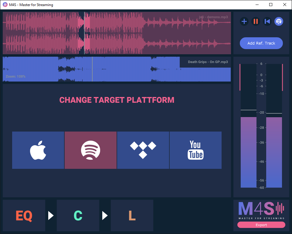
We had in mind that different users will have different screen sizes and aspect ratios. Therefore the application has to be responsive to the screen size it appears on the user’s screen. Responsiveness is already a proven feature in today’s websites, so we used website concepts to structure the areas of our application. As a result we have a header area, a main content area, a sidebar, and a footer.
All of the components except the main content area are fixed size in one axis. The main area (where the processors go) responds completely to the window size, so the components inside the processors have to be arranged in a flexible grid and can’t be arranged statically.
Colors
In terms of colors it’s often about feelings and familiarity, so there are endless possibilities for colors. We eventually came up with a modern, dark color palette with powerful accents. The accent colors remind of the Material Design Color Palette which creates a kind of familiarity to the user, because it’s seen in most of the available Android applications and on many websites around the web. The dark backgrounds have to calm the eyes, so that your eyes don’t hurt even after hours of working with the audio.
To give the user feedback which component he is working on right now, every processor has its own dedicated color. You can find the color palette in the post “UI Colors”.
Typography
We used “Roboto” by Google Fonts as the main font of our application. It’s contemporary, easy to read, free and it comes in many varieties and weights. And we instantly liked it, that’s why it made it into the application.
3. Implementing the UI
3.1. Main UI
Creating the Main UI of M4S was probably not the most challenging part - but still very interesting. First I started with adding Colours - without thinking about how we should add colours (Side note: USE A CUSTOM LOOK AND FEEL IN JUCE).
Playing around with the Juce UI, I realized we need somehow a possible way to add SVG’s or images to Juce.
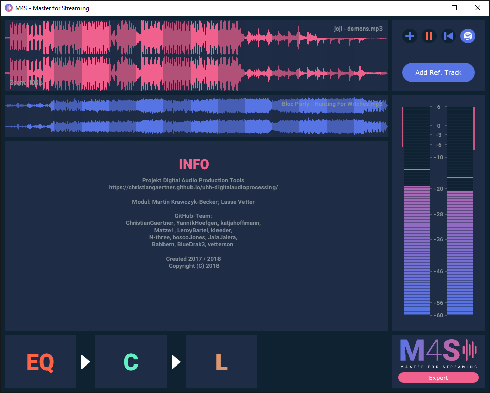
This was our mockup by Lasse [UI]:
This is how we started:
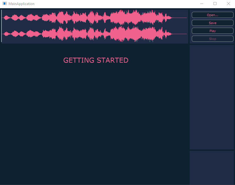
A simple waveform, some added Colours like in the mockups and some buttons. Not very much for the beginning, but we already got our grid in values.
// [UI] Structure Rectangles
Rectangle<int> rect_structure_trans;
Rectangle<int> rect_structure_wave;
Rectangle<int> rect_structure_main_plug;
Rectangle<int> rect_structure_loudness;
Rectangle<int> rect_structure_list_plug;
Rectangle<int> rect_structure_info;
Rectangle<int> rect_structure_reftrack;
We started by adding SVGs. And the Dummy Logo + Icon. (See also: SVG post in blog)
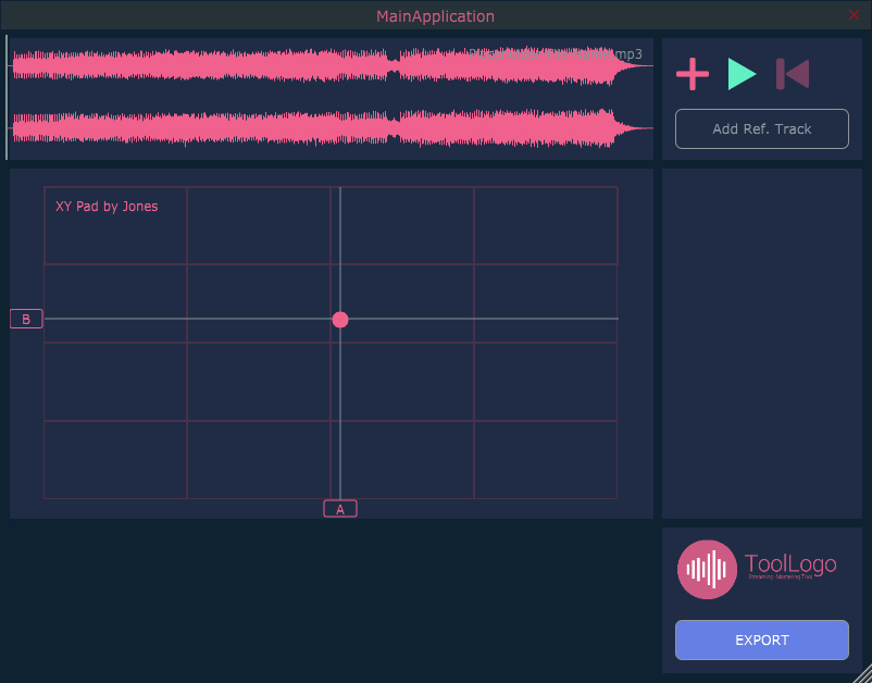
Then we proceeded with splitting the MainUI in components and only painting them when they are needed. Finally we added a M4SLookAndFeel (Custom Juce Look and Feel), added the Colours and override our UI functions for Sliders etc.
Setting up our Colours in a namespace:
namespace M4SColour
{
    const Colour col_str_bg(15, 34, 50);
    const Colour col_str_dark(31, 44, 69);
    const Colour col_str_white(255, 255, 255);
    const Colour col_str_light(135, 145, 153);

    const Colour col_primary_100(240, 97, 141);
    // [...]

    const Colour col_secondary_100(87, 116, 228);
    // [...]

    const Colour col_reserve_1(97, 240, 196);
	// [...]
};
Override drawLinear Slider for customizing the Slider UI:
// [UI] Overrode Slider Method for UI
void M4S_LookAndFeel::drawLinearSlider(Graphics& g,
	int x, int y, int w, int h,
	float sliderPos, float minSliderPos, float maxSliderPos,
	const Slider::SliderStyle style,
	Slider& slider)
{
	g.fillAll(M4SColour::col_str_bg); // Draw the Background
	g.setColour(slider.findColour(Slider::thumbColourId)); // Set Slider Colour
	g.fillRect(x, y, (int)sliderPos - x, h); // Draw Thumb + Slider
}
After this I started adding / customize all the still needed components like the target plattform changer.
3.2. Limiter
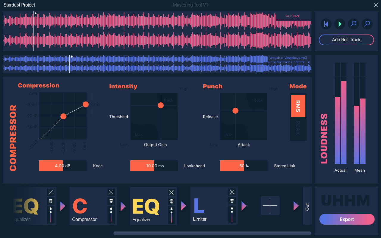
The M4S-Limiter is rather simple. Our main idea was to have a histogram of the whole track - displaying both the division / frequency of loudness in the track and the gain reduction. Since we don’t need any threshold given by the fact that we already have a “global” one - we still want to have an Attack and Release value for the limiter.
So we display the following:
- XYPad for Attack and Release
- LinearBar Slider for the stereo link
- Custom Histogram
We decided to solve it (like in the compressor) via a XYPad for Attack and Release, giving the XYPad the needed ranges and finally adding a slider for the stereo linking value.
3.3. Compressor
The main focus in the compressor are the threshold, the output gain, the attack, the release, the ratio and the knee. As mentioned in the UI concept the user has to be able to manipulate those parameters even with eyes closed. Luckily some of the parameters can be paired to a XY Pad. All other parameters are represented by simple vertical box sliders.
In addition to the UI elements for tweaking the audio, the user gets visual feedback of the parameters threshold, ratio and knee by drawing them into a input to output compression function, which is placed prominently in the top left of the compressor editor.
3.4. Equalizer
Our goal with the equalizer was to keep the xy pad aesthetic and to have a full-component display in order to have enough room to fine tune each individual EQ band. We went ahead and designed an EQ as minimalistic as possible using two main sliders to adjust the frequency and the gain respectively (just like an xy pad) and an area indicator for displaying the Q value of a band, which can be adjusted by scrolling the mouse wheel. For further detail, we added an info menu that pops up whenever a band is selected in which one can also input the exact number for each EQ parameter.
Our next goal with the EQ is to have a frequency representation of the input and/or output signals, so that it is easier to see problem areas in the frequency spectrum.
3.5. UI Components
While thinking about how we should display each plugin in the main UI of the application, we went with the idea of a plugin chain that is represented by ‘plugin boxes’ having arrows pointing to the next chain element. One important aspect was that the chain should be intuitive to use and allow adding and removing plugins, as well as changing their order without thinking too much about it, since the main focus is on the plugins themselves. Also, adding to the intuitive aspect, we used our color scheme to show everything related to one plugin in that one color (e.g. showing the compressor gain reduction on the loudness meter in the same colour as the compressor).
One of our components is the XYPad - you can also find a blog post about the XYPad on the M$S IO page.